One of the many things I admire about Python is how easy it is to get some of the most complex seeming things to work. I was recently playing around with being able to produce some visualizations for a personal project of mine and ended up creating some things. So this post is a way to document parts of that process.
The Library
The Python library I will be using for these examples is matplotlib. It comes with a wide range of ways in which data can be plotted and represented via charts and histograms.
To install the library please enter the following in your command console.
pip install matplotlib
This will take a few seconds and install the library. Once this is done, you can now import the library into your code and start developing the program. For the sake of brevity I will document 3 types of charts that I created using data of Covid19 in different parts of the world since April 1, 2020. I got the data as a subset of the larger dataset from ECDC’s website.
Example 1 – simple plot
To keep things simple I plotted the April case count data for Qatar’s Covid19 daily reported infections. The complete code for it is below.
import matplotlib.pyplot as plt  #to implement plots
import csv                       #to read and process CSV files


dates = [] #x-axis data
cases = [] #y-axis data

#open CSV file
with open('qatarcovid.csv') as csvDataFile:
    csvReader = csv.reader(csvDataFile)    #file handler
    for row in csvReader:                  #loop through file handler
        dates.append(row[0])               #load up first column element into dates
        cases.append(row[1])               #load up second column element into cases

cases_int = list(map(int, cases))          #convert string list of cases to integers for plotting
plt.plot(dates,cases_int, marker="X")      #plot the data with X as the marker for each point
plt.title("Qatar Covid19 Cases (April)")   #give a suitable title for the plot
plt.show()                                 #show the plot

The part that stumped me for a few minutes when writing this was that Y-Axis data was not numeric since it was read as a String from the CSV. So, the converting String to Integer bit was a critical piece. Also, the toolbar that comes associated with the plot viewer is loaded with options.

It allows you to create various views, zoom into specific parts of the chart, adjust the pan settings and save the image as PNG. The left and right arrows allow you to traverse between the different views (like Undo and Redo) you create in this viewer.
Example 2 – more detailed plot
For the second example I tried to add more detail into the plot keeping with the same design. For instance, what if I wanted to compare the daily new infection rates of two or more countries? Say, for instance, I want to see the case counts of Qatar, India and United Kingdom for the month of April. What would that look like?
To do this, basically what we will do is add more Y axis data without changing the X-axis (which remains the date). The updated code for this is as follows. The more plot() calls we make after that the more data gets displayed in the chart. I have also added some parameters for each plot( ) to be able to differentiate between them.
import matplotlib.pyplot as plt  #to implement plots
import csv                       #to read and process CSV files


dates = [] #x-axis data
casesQat = [] #y-axis data 1
casesJap = [] #y-axis data 2
casesInd = [] #y-axis data 3
#open CSV file
with open('multipleCountryCovid19.csv') as csvDataFile:
    csvReader = csv.reader(csvDataFile)    #file handler
    for row in csvReader:                  #loop through file handler
        dates.append(row[0])               #load up first column element into dates
        casesQat.append(row[1])            #load up second column element into cases
        casesJap.append(row[2])
        casesInd.append(row[3])

casesQatInt = list(map(int, casesQat))          #convert string list of cases to integers for plotting
casesJapInt =  list(map(int, casesJap))
casesIndInt=   list(map(int, casesInd))
plt.plot(dates,casesQatInt, color="#444444",linestyle="--",label="Qatar", marker="X")      #plot the data with X as the marker for each point
plt.plot(dates,casesJapInt , color="#5a7d9a",label="Japan", marker="+")      #plot the data with + as the marker for each point
plt.plot(dates,casesIndInt, color="red",label="India", marker="*")     #plot the data with * as the marker for each point
plt.title("Qatar/Japan/India Covid19 Cases (April)")   #give a suitable title for the plot
plt.legend()    #displays legend on which line relates to which country
plt.tight_layout()  #auto adjust of plot for better viewing
plt.show()          #show the plot

Example 3 – advanced methods
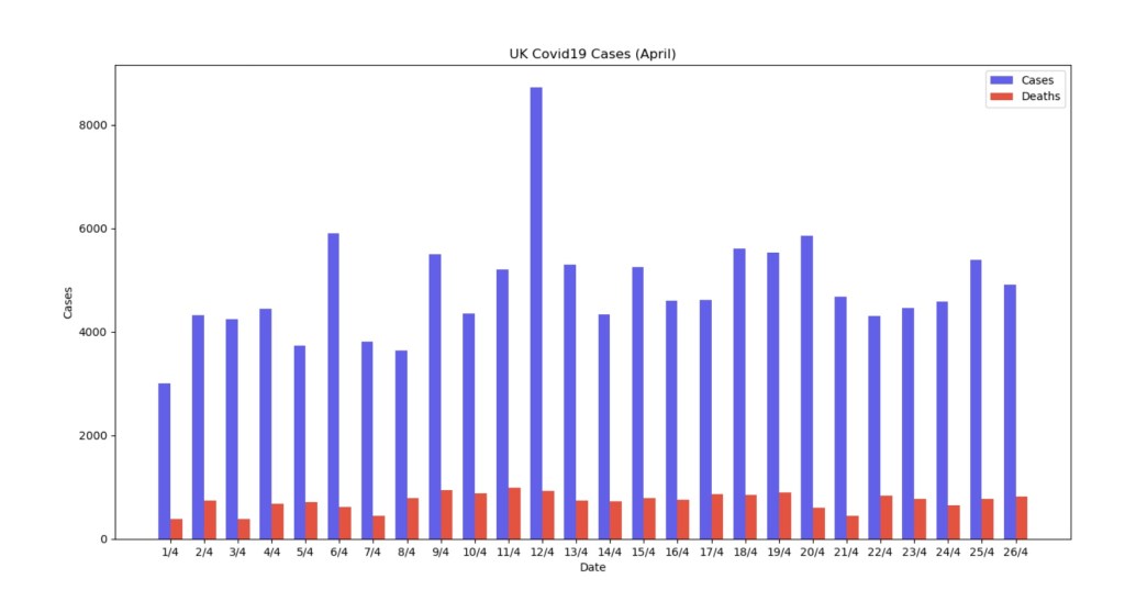
In the previous example we plotted cases against dates. Now, we will add another variable to the plot – number of deaths reported on that day in April. We will use a stacked bar chart for this – so that deaths on that day will sit on top of the infection rates. Since in Qatar’s case these values are, fortunately, low I used UK’s example where daily deaths have been, tragically, high on a daily basis.
In this example I will be grouping the infection and death rates together for each day. So the code that produces this effect will look slightly different. Some things will remain the same. Such as:
- Reading the CSV as before except this time we will read a third column for the death counts.
- A new array will be created to read this data and converted to integer.
The source code for this will look as follows. I used a bar chart this time for better reading of the different daily counts. I also included a legend for more clarity. The code and output produced is as below.
import matplotlib.pyplot as plt  #to implement plots
import csv                       #to read and process CSV files
import numpy as np

dates = [] #x-axis 1 data
cases = [] #y-axis 1 data
deaths = [] #y-axis 2 data

#open CSV file
with open('UKCovidApril.csv') as csvDataFile:
    csvReader = csv.reader(csvDataFile)    #file handler
    for row in csvReader:                  #loop through file handler
        dates.append(row[0])               #load up first column element into dates
        cases.append(row[1])               #load up second column element into cases
        deaths.append(row[2])


cases_int = list(map(int, cases))          #convert string list of cases to integers for plotting
deaths_int = list(map(int, deaths))        #convert string list of deaths to integers for plotting
x = np.arange(len(dates))                 # the label locations


fig, ax = plt.subplots()            #this wrapper is useful to create custom layouts
width = 0.35  # the width of the bars
#these bars are connected to cases and deaths accordingly
bar1 = ax.bar(x - width/2, cases_int, width, label='Cases',color='#625FE9')
bar2 = ax.bar(x + width/2, deaths_int, width, label='Deaths', color='#E45240')

ax.set_ylabel('Cases')      #axis setting of Y label
ax.set_xlabel('Date')       #axis setting of X label
ax.set_xticks(x)            #axis setting of X ticks
ax.set_xticklabels(dates)   #axis setting of X tick labels
ax.legend()                 #used to include information on titles of bars.

ax.set_title("UK Covid19 Cases (April)")   #give a suitable title for the plot
plt.show()                                 #show the plot
Further work and thoughts
The matplotlib library is an exhaustive collection of various types of charts and graphs that can read and display content in various ways. It can also be used to create animated and interactive plotting content which I aim to explore further. Visual representation of data can enable different ways of analysing it. Having a strong library like this in Python can be a powerful part of any automated solution. I will also be looking at reading content directly from API sources and projecting them onto a plotting element in Python.
Few important resources that I think can help both beginners and experienced plotters alike.
- https://matplotlib.org/ – The main website for the library is perhaps the best starting point. It has all the relevant documentation and plenty of examples and tutorials for added support.
- YouTube, as always, holds several well documented tutorials that take you step by step through the process. A few of the good ones I enjoyed watching and following.
Happy plotting!
