The backdrop
One of the first units in my Middle School Computer Studies class this semester has been working with Google’s Data Studio to visualize different kinds of data sets. But before I dive into my observations on this first time attempt of mine, I wish to capture a bit of the history. Few years ago I discovered Awesome Tables – a visualization platform that integrates seamlessly with data sources such as Google Sheets. I used it pretty extensively in my previous school to capture various kinds of data. Some of them included:
- A centralized Middle/High School student support system that was used by teachers to report, document and follow up on academic/behavior/IEP related details. The sidebar feature in AT allowed for a more integrated look at each individual student’s entries which could be read like a running summary based on teacher’s name and timestamps from a Google Sheet.
- Summarized staff absence reporting system. Advanced filters allowed for Human Resources and Leadership Team members to run a lot of different kinds of queries/reports for their management purposed. The data source for this was a master Google Sheet that was linked to several other sheets and updated itself in real time.
- An interactive internal and external staff directory. This was perhaps the most fun for me to work on given that it required loading up images from several locations. The images were linked up using reference points within the Google Sheet and were loaded up into AT in a grid layout. Filters allowed people to search for staff based on school levels, name, subject areas etc.
After a few years of successfully implementing such dashboards I started noticing that AT’s licensing policy was getting bizarre. Views that I had so painstakingly created started giving out errors due to limits on the free account. Attempts to contact the company also did not go anywhere. This was around the time, in 2019, that I discovered Google’s Data Studio. Chris Smith (who works as a data analysis expert at Singapore American) was a big part of my continued exposure to this visualization platform. I also saw various examples in my PLN on Twitter that regularly highlighted the benefits of using a visualization tool like Studio. I then migrated some of my previous AT based systems to Studio and the results were quite interesting. Although I did not get a chance to implement it fully, I wanted to explore it further in my new role at my current school in Aberdeen.
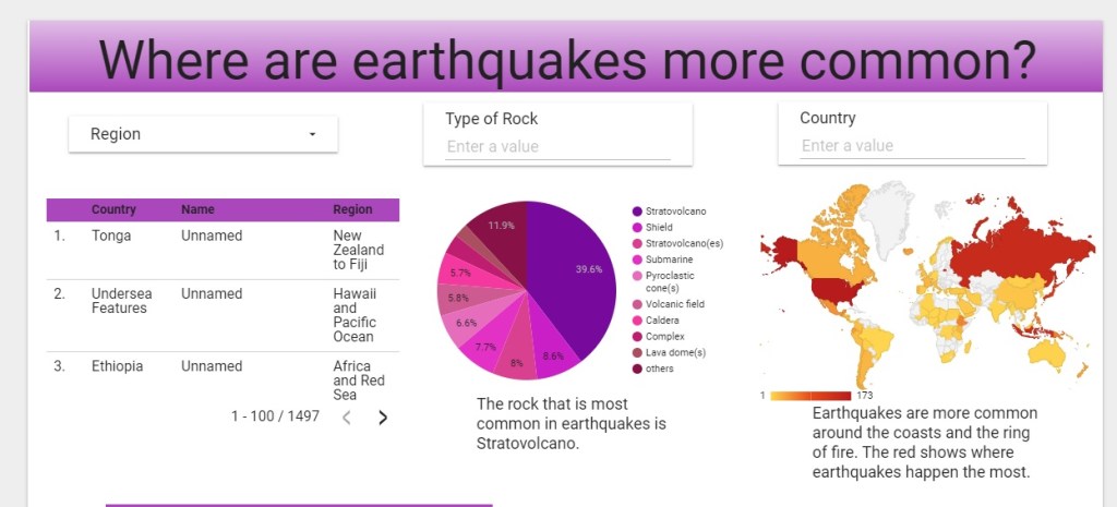
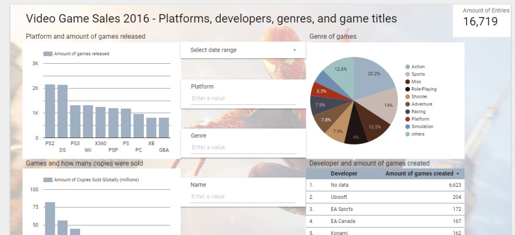
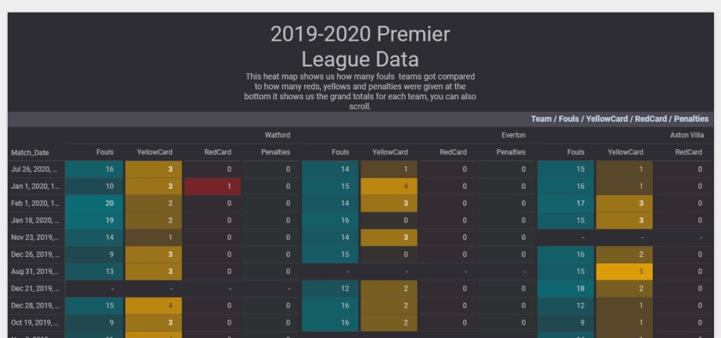
So, as a way to get students to work with this I designed a short 3-4 week unit around this tool. We began our work by getting Chris to join us remotely via Meet a couple of times. He walked us through some excellent examples that he had designed for his school. He also gave us insights into how planning the design is key to using a tool like Studio. Using his pointers we set about playing around with various features such as calculated fields, dimensions, geo-enabled charts, filters etc. Given below are some examples of final reports that my students created.
Observations and lessons learnt
The interface for designing a data report in Studio may seem a little overwhelming at first, but like any platform, consistent efforts and careful adherence to the design plan can do wonders. Since students were working with something like this for the first time, I spent up to 5-6 lessons getting them to focus on and improve their data fundamentals. The why? before the what? how? and where? of data needed to be examined. Why are we doing this project? Why is data important? Why do we need to find different ways to show the data? Why is it important to understand our data? Once we had gone past these crucial elements, we then started our journey in finding the right data set. This was, in some ways, the real challenge. There are plenty of open data sets available for download and use but in an academic setting it is important to vet them for both relevance, authenticity and quality. During this research, here are some websites I/we found that offers some interesting data sets to play with.
- https://data.fivethirtyeight.com/
- https://www.kaggle.com/datasets
- https://cloud.google.com/bigquery/public-data/
These sites allow for data to be downloaded as CSV so that students can then convert them into a Google Sheet to work with Studio. The data then goes through – cleanup (ensuring there is data consistency), authenticity check (ensuring sources are cross checked) and testing (where data is connected to the dashboard and a few sample charts/queries are created).
This was a really fun project to do with the students. Not only did we get into some important areas of data science and related research but we also realized that having a tool like this is cross curricular. The skills they picked up during this unit, I am hoping, will be used to read and examine data in their other classes. I look forward to repeating this project with deeper context/content next semester!
