Over the years I have loved experimenting with different ways to visualize data from both inside and outside my classrooms. Up until 2014, most of my visualization work was primarily in Excel or Google Sheets (via the built in Charts). But then I started working extensively with Google Scripting and during that process I came upon awesome tables (AT). It used to be it’s own widget/product but maybe a year ago (?) Google bought it. This in some ways has made the interface less clunky and more visually appealing.
But before I tell you more about AT, a few weeks ago I learnt of Google’s Data Studio from my colleague. We did talk about how it looked very similar to Awesome Tables but had lots of other advanced customization elements to it which are not available (yet) in AT.
So, as a way to make this blog more informative, I would like to briefly discuss both AT and Data Studio in this post.
Awesome Tables (AT)
One of the reasons I came upon this widget was because some of the systems I had helped design at my current school were creating lots of daily data. It wasn’t thousands but definitely in high hundreds. Admin wanted some way of visualize this data. In my search AT surfaced. If you have data in a Google Sheet then linking up that sheet with an AT view creates different types of visual interfaces for you. For instance, if I am collecting student data of any kind – feedback, absences, grades, standards assessed (if you do that), then AT can help you build a quick interface with filters that will allow you to both search and filter things.
Example: Given below is a Google Sheet I made up with some student data collected via Exit Tickets (via a Google Form, say). Notice that in row 2 I have added some words for each column such as hidden, categoryFilter etc. These are required by AT to create the view according to what I want to see. You can read all about their documentation to know more on how to use all this.
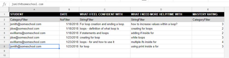
Now, imagine such an exit ticket sheet with dozens or hundreds of entries. To quickly be able to filter, sort, and visualize such data an awesome table can be a good option.
To do this, go to AwesomeTable, log in with Google, and create a new View by using the + sign.
Next, select your Data Source (which in this case is my Exit Tickets Google sheet).

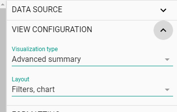
And then, select Advanced Summary from the View Configuration option. There are other types of configurations too but for the charts we need, this is the one we want to choose.
That’s pretty much it! Click Update and select the eye icon to view your awesome table view. In my case the link created is :
https://awesome-table.com/-LObm1usjeacoxTOUgsX/view

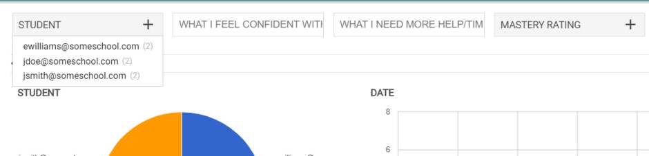
The filters that we entered on row 2 of our Google sheet are now in play. You will now notice them showing up at the very top of your view. Every time you select a new student the graphs, charts and other data changes. Isn’t that sweet?
While this may seem like an overly simplistic example, the idea is to help trigger more ideas for you. I have used AT for various systems in my current school, including a dynamic student concern reporting system, where data is sorted by student name/last updated date and all concerns reported for that student by various teachers is organized in one central location using the sidebar view as below. So it is like a running log/summary which is easily readable by any teacher/admin.

One of AT’s big limitations is that the data sheet setup has to be a certain way (with row 1 as column headings and row 2 as data filters) for it to work properly. Nevertheless it is a simple and easy way to throw lots of your prepared data into a visually dynamic platform.
Google’s Data Studio
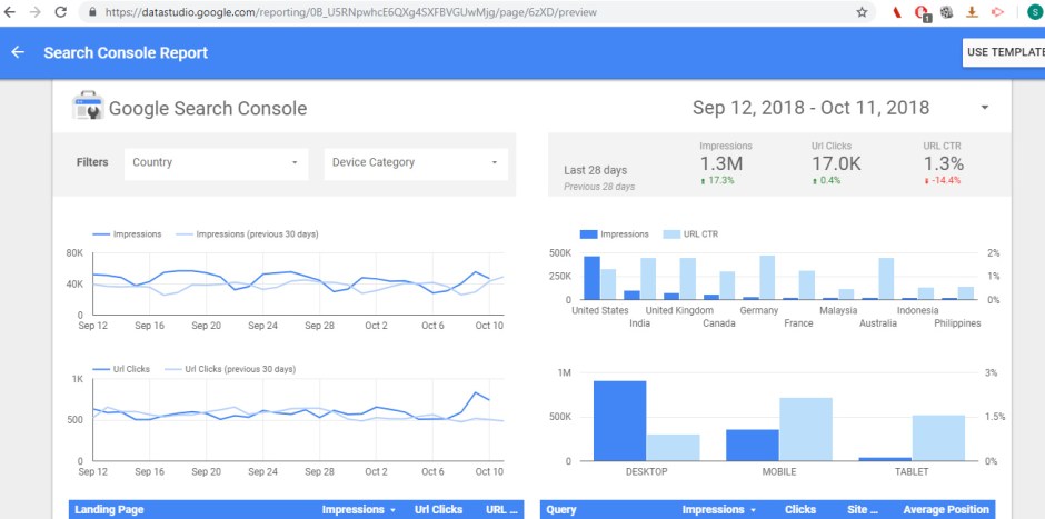
Perhaps inspired by this idea, Google’s Data Studio has a similar interface. Once you have signed in with your Google credentials, it gives an interface very similar to AT. You can either choose from existing templates (example below for a Search Console report) or make your own by selecting data source. You get an empty canvas where you can drag and drop different fields from your sheet/table data. The results are instant.
Now, knowing Google, one never is sure if such tools will remain free for long. Depending on how frequently and massively these tools are used they maybe included/unplugged from their services. But these are a good ready to use alternatives for any organization.
Conclusion
I have seen schools spend lot of time and effort (and money!) on 3rd party companies to get data dashboards etc created. This is obviously the right move if there is a clear mandate on the vision for that data towards decisions. But if you are looking for something more relevant for your classrooms and/or divisions that does not require/need a full blown dashboard then please take a look at these two options. There maybe more which I have not heard of so please write to me letting me know what your experiences have been in this direction.
-Shashi
